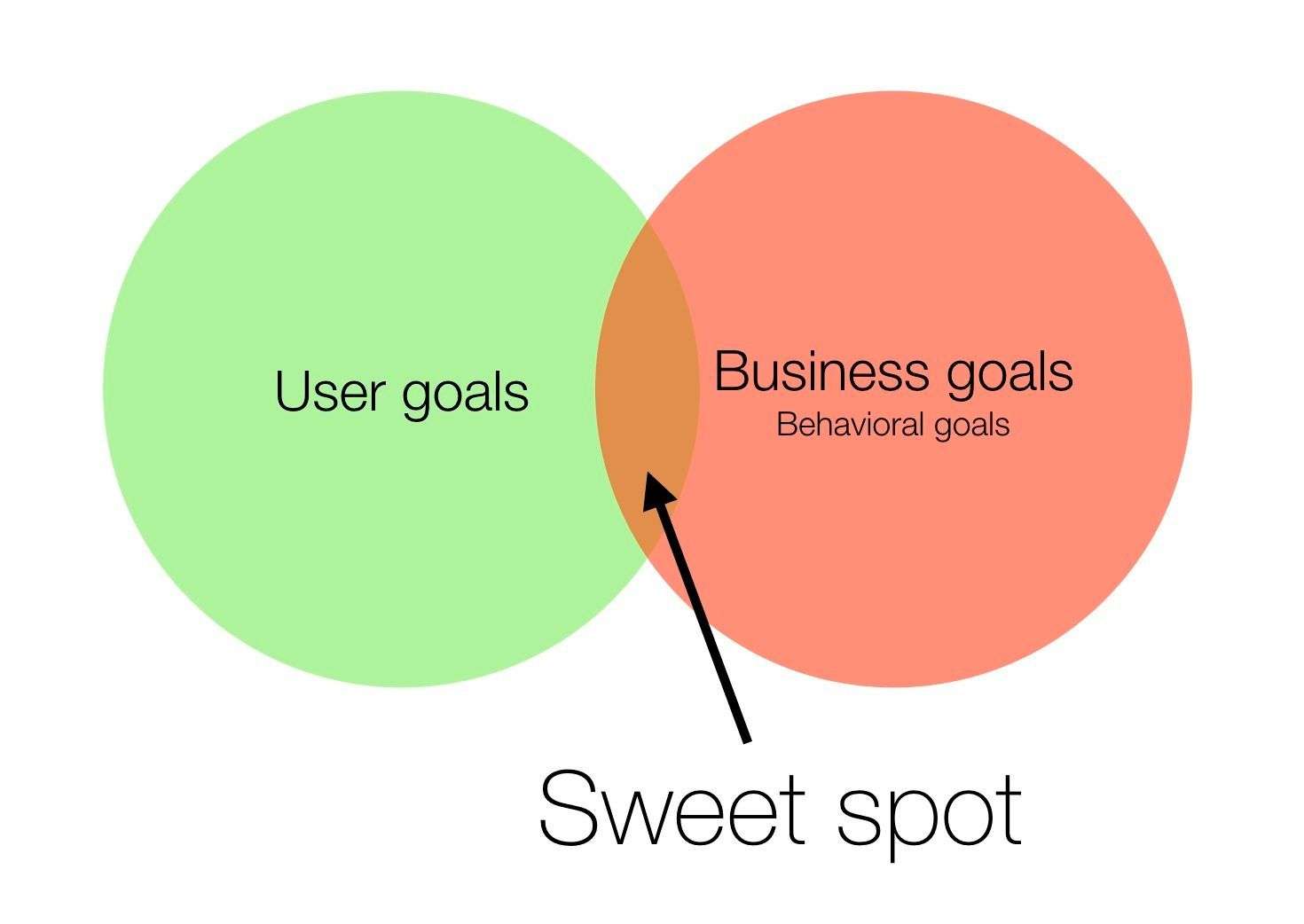
“The whole is other than the sum of the parts.” – Kurt Koffka
Everyone knows that design is subjective; what you like may not be preferred by someone else. However, there are certain design principles which, if followed correctly, make up a great design and help drive your lead generation and inbound marketing efforts. One such principle is the Gestalt Design Principle. Gestalt, meaning shape or form in German, is a theory which states that the mind perceives an object better as a whole rather than individual parts making up the object. In other words, great design is aesthetically pleasing since it is arranged in a uniform manner.
If you have a complex concept, the mind may find it difficult to figure out your objective. This could also be the reason why most social networking sites follow a similar look and feel. When a design is proven to work, why try to change it? Understanding and applying the Gestalt Design Principle can help you learn about your customer’s behavior and buying habits. In the digital age, your company’s identity is mostly known through its website. The first step a potential customer takes is to go onto your website. This is where the use of Gestalt Design Principle comes into effect.
The Gestalt Design Principle consists of five major rules:
- Figure-ground relationship
- Similarity
- Proximity
- Uniform connectedness
- Good continuation
Figure-Ground Relationship: There is a reason why figure-ground relationship is at the top of the list. It is one of the most vital rules of the Gestalt Design Principle. The figure-ground relationship is used to separate the Figure (the objective) from the Ground (the background). If your customer cannot decipher what the main objective of your website is, they won’t bother to stay on it. The figure has to be easy to find and easy to understand. It should be the first thing the customer sees when they go onto your website. That is why they’re there in the first place.
The figure-ground relationship also applies to text links, buttons and tabs on your website. You must have noticed that text links are usually in a different color or underlined. This helps in making the customer perceive them as clickable and sets them apart from regular text. Buttons and tabs on a website are also in different colors, so the customer knows that clicking a button will lead them to a new page. These can also provide a path for your customer to follow in order to either fill a subscription or contact form, resulting in lead generation.
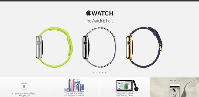
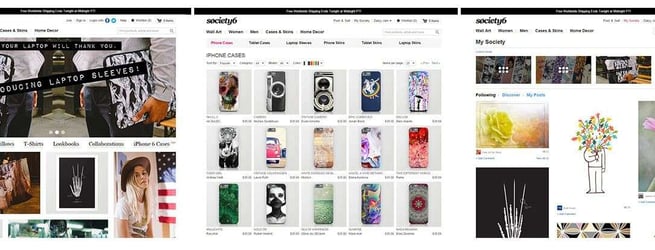
Similarity: While analyzing your website, check for Similarity. Does your website look consistent? Do all the buttons have the same color, and if not, is it because each button has a different objective? A website has to follow a certain theme throughout in order to make it look consistent. It must look like it belongs to one entity. If your website uses various colors and various themes, the customer may get confused and decide to leave. If your website has a navigation bar on the left, make sure it stays on the left throughout the website. If your buttons leading to new pages are in blue, make sure they’re in blue throughout. You don’t want to lose potential customers because you couldn’t provide a certain sense of similarity.
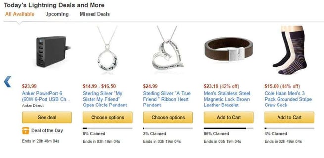
Proximity: If you look at an E-commerce website, you’ll see a product and usually a “buy now” button right next to it. You can immediately relate those two together. If you click the “buy now” button, you know you’re buying the product right next to it. That is the rule of Proximity. Certain objects, when placed next to each other, are usually grouped together. If you’re looking for subscriptions, make sure the benefits of subscribing are next to the subscription form. However, if your subscription form is somewhere on another page, the customer may forget the benefits by the time they actually land on the subscription form.
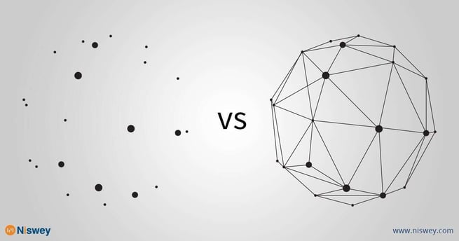
Uniform Connectedness: Uniform connectedness can be best described as connecting the dots. It may look like a bunch of dots on a piece of paper, but once you connect them with lines, they form a whole image. In a similar fashion, your website and its different pages may look odd by themselves, but once you link them together, visually, they become one whole entity. Uniform connectedness provides a path for your customer to follow; each link is like a road they have to take in order to reach their destination. That destination may be the contact page or a subscription form. As long as you can provide a smooth connection between these roads, you shouldn’t have a problem in lead generation.
Good Continuation: Good continuation is about providing a perfect segue for a new topic or a new page. In most websites, the homepage provides a summary of the services provided by the company. For visitors who want to know the services in detail, there will be a separate page dedicated to the services. The link to the services page will be provided in proximation to the summary of the services. This is good continuation. It provides a certain flow to your website, which makes it easier for the customer to navigate through it and thus drives lead generation. You want to make life easier for your potential customers if you want them to be converted into loyal ones.
Gestalt Design Principle can effectively be used to generate leads through your website. Keep in mind the five rules, and you should have a user-friendly website which will keep your customers hooked. In recent years, the understanding and the application of design by companies has increased rapidly. Design has become a crucial component in raising value for companies. Take some time to analyze your company and how design is benefiting it. You never know how much difference a simple design flaw could make.