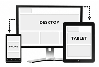
One of the hottest issues these days is accessibility of websites on various devices other than the standard desktop or laptop screens. Users who access your websites through their mobile devices or other display screens do not care what method you use but it’s you who needs to decide it based on your resources.
With this blog post we are not solving your mobile first or web first quest as we expect you’ve already done a thorough research on it because it’s a part of your business model. This blog post is for those who already have a website and are confused between mobile website, adaptive design, mobile/tablet application and responsive design. At the end of the blog post you would be able to decide which technique is good for your business.
So, let’s discuss each of these methods one by one to draw a better conclusion:-
1. Mobile Website
With more than a billion mobile Internet users across the globe you can’t simply ignore this medium and this is one reason why a mobile compatible website is a must have feature. A mobile site is perfect for those who generally have static content on their website with very less user interaction. The main objective of having a mobile website is to make your website accessible on mobile web browsers with a minimalistic approach.
If I have to explain a mobile website in my own words then I would explain it’s a RSS feed of your original website with some more visual content (images, colorful texts) and other hyper-links.
2. Adaptive/ Cross-Device Compatible Design
This is another technique of making your website compatible by optimizing them specifically for certain devices. Now the biggest question comes that what devices should you target. To answer this you need to look into your website analytics, see what all devices people are using to access your website, what all browsers are they using and what all mobile operating systems are they using. This would give you a rough idea about the devices on which you should focus.
Eg: If you are observing that most of the people are using iOS to browse your website or say they are using Safari browser then it clearly indicates that you should make your website compatible for iOS devices including iPhones and iPads.
So, a compatible/adaptive design is for those websites where there is a little more user interaction, more complex design elements and you don’t want to compromise with the beauty of your website.
3. Mobile/Tablet Application
The most fascinating word in the design industry these days, is Apps. Every second client wants the mobile application for their website without knowing whether it would work in their case or not, it’s now more of a status building approach rather than a problem solving approach.
Even your website analytics can’t give you a clear picture that whether you should go for a mobile application or not. Eg: If 60-70% of your mobile traffic is coming from iOS and Android devices it doesn’t ensure that you should go for a mobile application for these platforms.
Since it is difficult to get your app identified and downloaded by people, you would later on annoy your mobile users by those pop-up messages on your website forcing them to download the app. There are some more questions that you need to ask yourself before going for a mobile application as I have seen plenty of those apps at the play/app store with two digit overall downloads.
How often will your targeted user access your website? i.e. What’s their frequency of accessing your website in a day, week or a month? – To answer this you need to look into some deep analytics as that will give the right picture of this number and apart from this analysis you’ll also need to do a survey with your existing customers whether they would like to have a dedicated app of your website.
4. Responsive Design
Responsive Design is an approach aimed at crafting sites to provide an optimal viewing experience regardless of the screen size (from desktop computer monitors to tablets to mobile phones)
Responsive is more of a methodology than a design technique. Responsive means reacting quickly and positively to whichever device you are using to access the content. Responsive Design adapts the layout to the viewing environment by using fluid, proportion-based grids, flexible images and CSS queries.
Now let’s talk about it’s pros and cons:
Pros:-
-
You don’t need to create different adaptive designs for different sort of devices.
-
You don’t need to update content multiple times on your apps or mobile sites.
-
It’s a one time investment and you don’t need to optimize your site time and gain for any specific device.
Cons:-
-
Responsive Design takes time as you will have to design several different layouts via wireframes
-
Development Time: The initial development of responsive web design takes much longer time in comparison to mobile or adaptive designs.
-
The load time of the website increases on mobile devices because it downloads some extra HTM/CSS code with images.
Some example of Responsive Web Design are:
To conclude I would say there is no right or wrong approach. It depends on multiple factors like in what stage your website development is, who is your reader, the analytics, your budget, your need and most importantly what your reader wants.
So, I believe this brief differentiation would help you in deciding whether you need a mobile website, a mobile app, an adaptive design or a responsive design for your website. What do you think are the deciding factors in your case?


