Have you ever noticed the profile page layouts of Facebook, Instagram (web), Twitter, LinkedIn and Flickr? Before I dig in deeper and try to make sense of how I see them, I would like you to have a look at them:
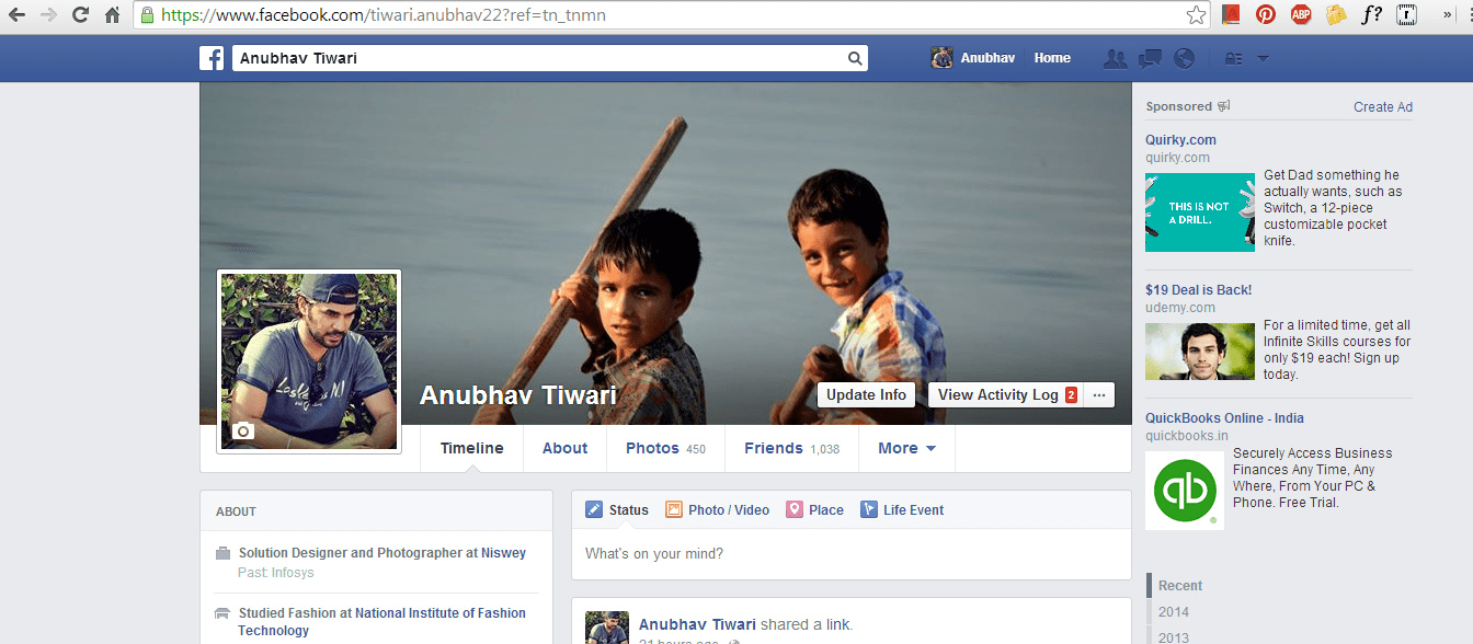
Facebook Profile page looks like this:
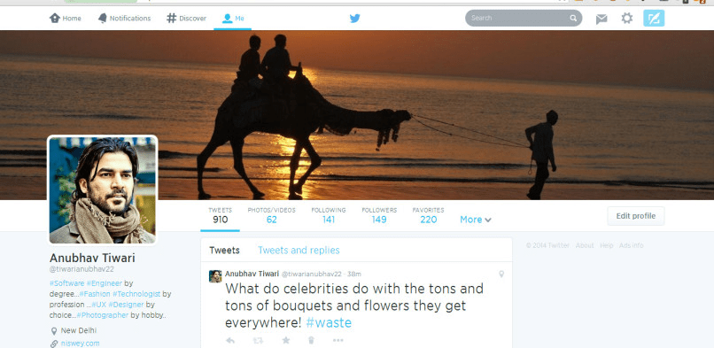
Twitter “Me” Page:
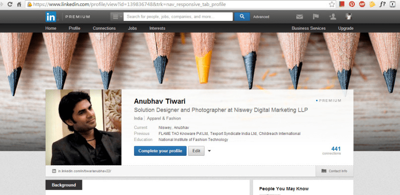
LinkedIn Profile Page:
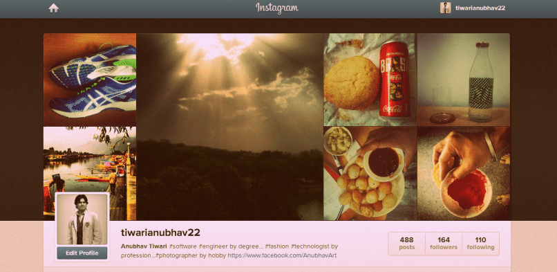
Instagram Profile Page:
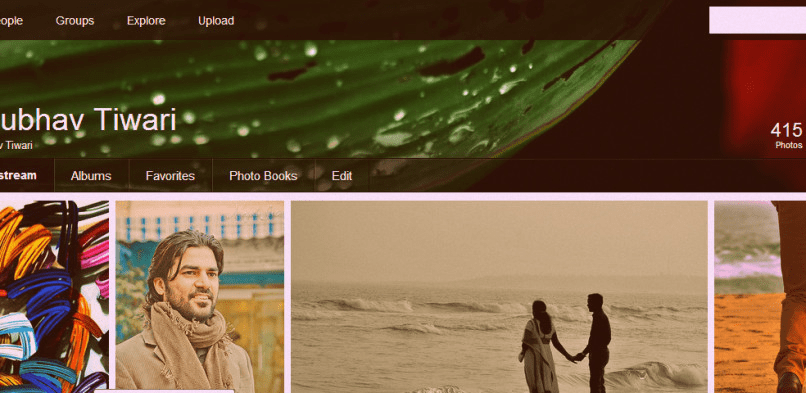
Flickr “You” Page:
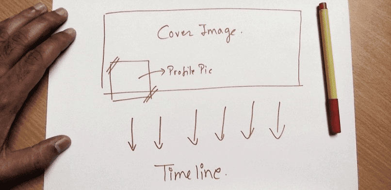
Do you see a pattern? The layout of all these pages has something similar. There is a pattern with the cover image covering the screen length, a profile picture in the left corner, and then the build up.
This is the basic layout of all these pages:
But why do profile pages of all these Internet giants have similar layouts?
Are they copying each other?
Is there a lack of experimentation?
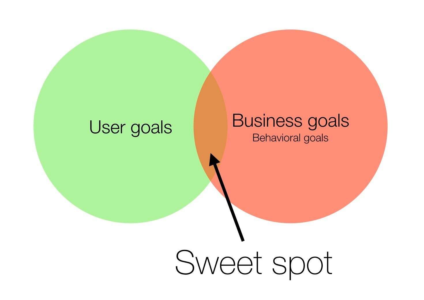
No. The answer is: User Experience, more commonly known as UX!
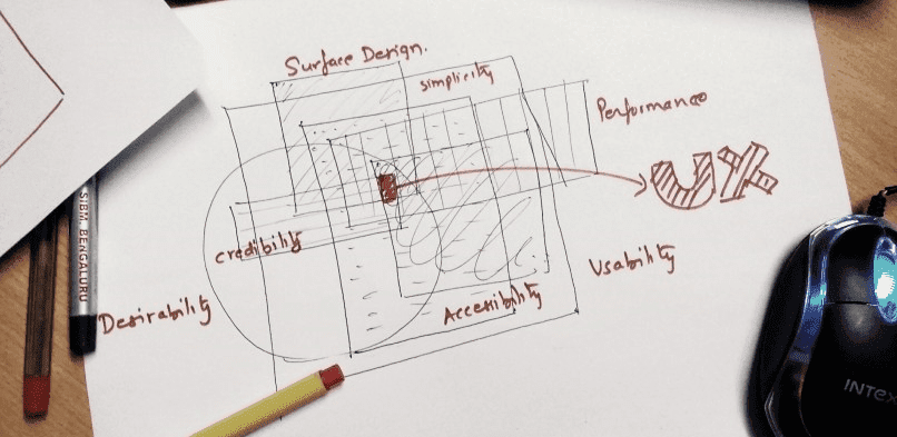
UX answers all the questions related to the target user of the website. When giants like Facebook and Twitter design these pages, they have to cater to their end users’ needs, experiences, comfort level and so on. And hence, it becomes important that they take the following factors into consideration when designing these layouts:
- Simplicity
- Performance
- Surface Design
- Usability
- Desirability
- Accessibility
- Credibility
It is not easy to arrive at one layout that incorporates all these factors. There is a cycle of events which needs to take place to achieve this. You start prototyping, you do a lot of research, then you make it, test it, change it, and the cycle continues.
Success is validated by the end user, and when you arrive at that, it becomes the norm.
These Internet giants must have gone through this rigorous process over multiple iterations before arriving at this layout, which has now become the norm.
And the story doesn’t end here. A lot of effort goes into interaction design, visual design, content strategy, data analytics and information architecture. And then one fine day, you may arrive at a design which most people like!
These big shots have realized that there is no point in making the website unique, visually appealing, different from others if the users are not sticking to it. There is no harm in having a layout that is similar to what others have if it’s working.
But there are a few questions which only the future can answer:
- Is user-centered design killing design innovation?
- Will aesthetics become secondary?
- Who will dare to take the next bold step to create a trend?
With the changes in the way users are consuming information on the Internet, everything is becoming more business-driven. Design is no exception. To stand out, designers will have to keep business—and UX—in mind.
Find out more on how your web design can help generate leas for your business.
.jpg)


.png)